AT A GLANCE
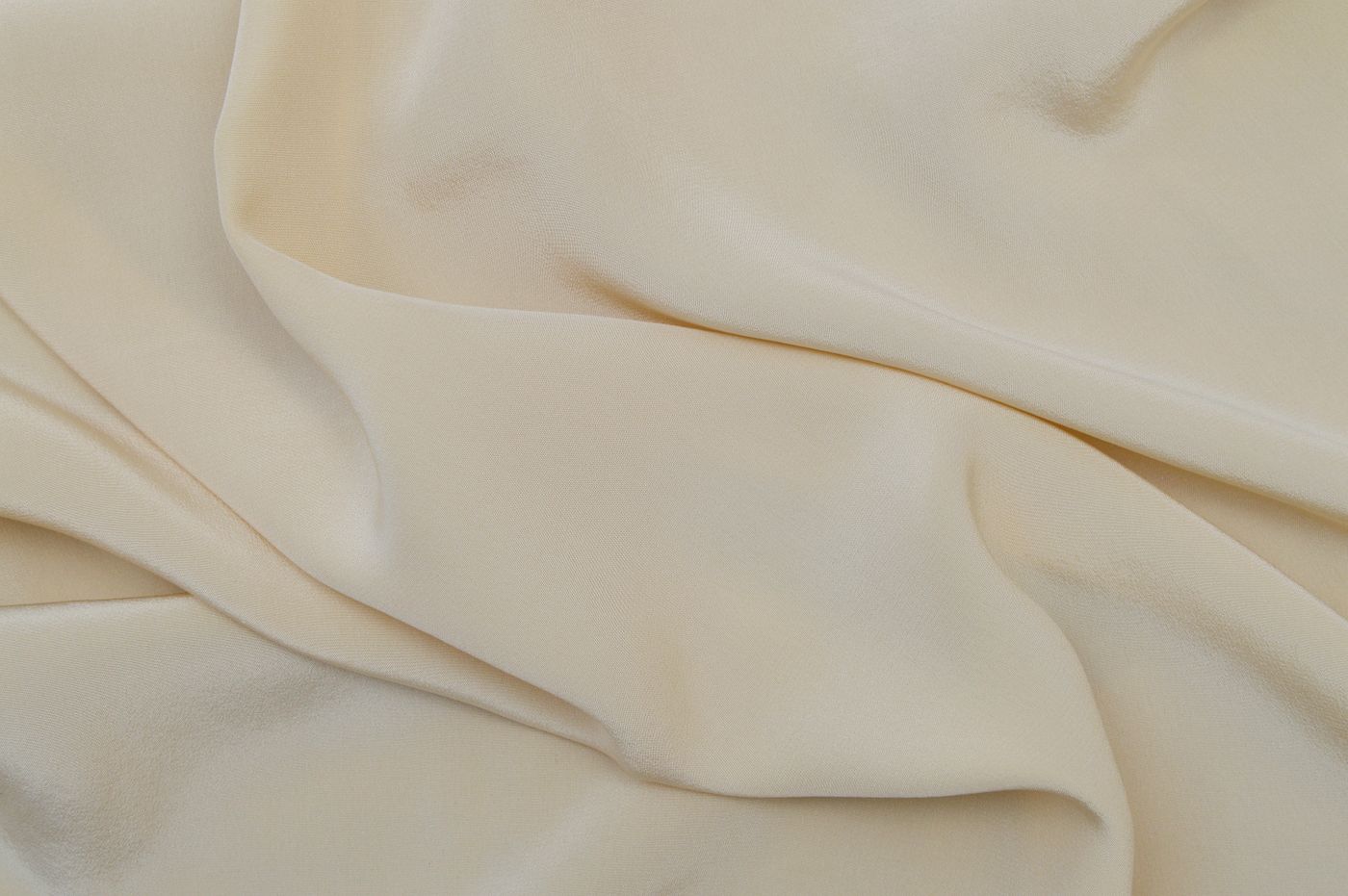
A satin surface changes as it turns toward and away from light, so its role in an outfit is different from a flat color swatch. This guide explores reflected highlights, folds, background garments, print visibility, and nearby materials. It shows how to evaluate a particular silk satin scarf through realistic viewing rather than treating shine as a universal measure of quality.
Make reflection part of the design decision
A silk satin scarf can introduce a distinct kind of brightness. Its color is only part of the impression; highlights appear and recede as the cloth bends. A dark scarf may contain bright folds, while a pale one may show deep shadow where it gathers. Thinking about this movement helps explain why the same scarf can look restrained in one photograph and conspicuous in another. The surface is participating in the composition rather than merely carrying a fixed color.
Before choosing a satin scarf, decide whether you enjoy that shifting attention. You might want a luminous accent against a matte coat, or a fluid highlight near an otherwise quiet neckline. You might instead prefer the scarf to remain visually consistent in varied lighting. Neither preference establishes a better taste. It identifies the role the material should perform. A successful choice begins with an effect you want to wear, not a general belief that the brightest surface must be the most luxurious.
Keep satin and silk separate in the description
Satin describes a woven structure, while silk identifies a fiber. The Museum of Fine Arts Boston's CAMEO reference explains the relationship between satin's long surface floats and reflected light, and notes that different fibers can be used in the structure. A scarf described only as satin has not yet answered the composition question. Read the actual fiber statement if silk content matters to your choice. Surface appearance cannot establish it on its own.
Once composition is clear, keep other claims separate as well. A silk statement does not identify the designer, the printing method, the edge finishing process, or the complete manufacturing history. These may be documented individually. A precise description makes comparison easier because each term has a defined role. You can then evaluate the surface for its visual effect without asking its shine to prove authenticity, origin, or a quality grade that it cannot establish.
Observe the scarf from more than one angle
Hold or view the scarf so that a broad area faces the light, then let it turn. Notice how the highlight moves and how much of the color remains visible outside it. The effect can differ across folds and printed areas. A static product image captures one relationship between camera, cloth, and light. It cannot represent every view that will occur while the scarf is worn. A short handling video or several ordinary photographs can therefore be particularly useful.
When trying a scarf in person, move naturally rather than tilting it only to find the most flattering angle. Stand, sit, and turn toward another part of the room. Ask whether the changing surface continues to feel coherent with the outfit. A scarf does not need to look identical from every direction, but the variation should be something you enjoy. If it works only under one carefully controlled angle, it may be better suited to a narrow occasional role than to the everyday use you originally imagined.
Compare ordinary lighting conditions
Consider the places where the scarf will be worn: daylight, a softly lit restaurant, a workplace, or a bright event space. The surface may contribute differently in each. You do not need to reproduce every possible environment, but comparing familiar daylight with normal indoor lighting can reveal useful differences. Avoid making the decision solely beneath a strong display spotlight or from a heavily edited image. Those conditions may emphasize reflection beyond what you will usually see.
Use a familiar garment as a stable reference during the comparison. A charcoal jacket you know well can help you judge whether the scarf becomes unexpectedly bright or changes its relationship to the clothing. If two product photographs show different apparent colors, do not immediately assume one is wrong. Reflection and lighting may explain part of the difference. Ask for clarification and use return terms appropriately if a subtle shade is important. Digital images are evidence to interpret, not perfect substitutes for the object.
Decide where the brightest area should sit
A satin scarf can become the visual focus even when its printed pattern is simple. Think about the placement of its highlights. A narrow folded band may concentrate brightness near the collar; a broad drape may spread it across a larger area. A knot creates curves and shadows that can make the surface more active. These arrangements are not interchangeable. Choose the amount and location of reflection that support the outfit rather than selecting a knot first and accepting whatever effect results.
If a broad luminous area feels too prominent, expose less cloth or use a fold that reveals a quieter section of the design. If the scarf disappears against a glossy garment, place it beside a more matte surface or change the visible color relationship. These are compositional adjustments, not corrections to a defective material. The same scarf can play several roles depending on the area shown. Small changes may be enough to make the surface feel deliberate rather than unexpectedly dominant.
Use matte garments as a contrasting frame
A matte jacket, textured knit, or soft woven shirt can provide a clear background for a reflective scarf. The contrast makes each material easier to notice. This can be effective in a restrained outfit because interest comes from surface rather than a large number of colors. A dark satin accent against a dark matte garment may remain within a narrow palette while still being visibly distinct. The relationship depends on light and texture as much as on hue.
Try the combination at conversational distance. A close view may emphasize fine cloth details that disappear in ordinary use, while the broad contrast remains. Ask whether the scarf's brightness feels proportionate to its size and placement. If the garment already contains pronounced texture or pattern, a simpler satin design may be easier to integrate. You can also choose a more expressive combination if that suits your preferences. The useful principle is to allocate attention consciously rather than assume that every interesting material must be displayed equally.
Combine reflective surfaces deliberately
Satin with polished metal, glossy leather, or another luminous textile can create a rich layered effect. It can also become visually busy if several highlights compete in a small area. Decide which surface should lead. A scarf may be the broad reflective field while a small silver earring provides a secondary point. Alternatively, a polished pendant can remain central if the scarf is positioned away from it or shows a quieter area. The arrangement should make the relationship understandable at a glance.
Avoid treating a rule against mixing shine as universal. Some outfits are intentionally reflective, and their coherence may come from repeated shapes, a controlled palette, or generous space between objects. Test the complete arrangement instead. If the eye moves between surfaces in a way you enjoy, the combination can work. If everything seems to demand equal attention, simplify one element. Removing a necklace or narrowing the visible scarf can be a more effective adjustment than replacing the entire outfit.
Examine the print through folds
A printed satin scarf combines imagery with reflected light. In a highlight, a color or line may read differently from the same area in shadow. Look at the design open, folded, and loosely gathered. A detailed image that is clear when flat may become abstract in a knot, while a broad color field may gain depth through the changing surface. Decide whether you are buying the scarf for a recognizable motif, a palette, or the overall movement of the design.
If a specific motif is essential, check whether it remains visible in the arrangement you plan to use. A folded band may conceal the center entirely and leave the border as the principal design. That can still be a satisfying choice, but it should be intentional. Do not rely on a product page's flat image to predict a worn view. The scarf's design becomes selective in use, and satin's reflection adds another layer of change to that selection.
Notice the reverse and edge
The reverse of a satin scarf may look different from the face. Ask for a view of both sides and observe what happens when a corner turns during wear. A contrast between surfaces can be part of the design's character. It becomes a problem only if it conflicts with your intended effect or was described inaccurately. Avoid continuously forcing every edge to show the same face if the cloth naturally moves otherwise. A practical arrangement should accommodate ordinary movement.
Inspect the hem and corners in relation to the soft surface. Look for secure finishing and any localized distortion or opening. A construction claim such as hand finished should be understood specifically rather than expanded into an assurance about every aspect of the scarf. The edge is a working boundary that influences how corners fall and how folds resolve. It deserves attention, but it should not become a single feature used to judge composition, authenticity, or the entire manufacturing history.
Test the amount of folded cloth
A fluid surface can still create a bulky knot when a large scarf is folded narrowly. Read dimensions and assess the actual folded volume. If the scarf feels crowded beneath a collar, change the fold or choose a different size rather than pulling the fastening tighter. The amount of fabric remains present even when compressed. A comfortable arrangement leaves the cloth enough room to settle and allows the neckline to function without pressure or repeated readjustment.
Compare a broad loose fold with a narrow band. The first may show more surface and reflection while the second concentrates both. Let the garment guide the choice. A structured jacket opening may frame one arrangement well, while an open shirt supports another. The scarf does not have to perform every shape shown in a styling demonstration. Its most useful role may be one or two arrangements that take advantage of its particular drape and keep the reflected light where you want it.
Consider contact as part of movement
Satin's smooth appearance should not encourage careless contact with jewelry or rough objects. Check nearby clasps, settings, zippers, and decorative hardware. The CAMEO reference notes the snag vulnerability associated with the structure's exposed floats; for daily use, this makes deliberate spacing worthwhile. Keep moving corners clear of unresolved roughness, and remove a piece of jewelry for assessment if a catching point is suspected. Do not use the scarf itself to test the surface.
Also consider the process of putting on and removing outerwear. A scarf can meet a zipper or bag strap even if it sits clear of jewelry when you are still. Try these transitions during the initial outfit trial. If something catches, stop the tension and identify the obstruction. Pulling harder can turn a small incident into a more significant defect. Practical handling supports the surface you chose for its appearance, allowing the textile to move without repeatedly crossing avoidable hazards.
Choose care for the finished product
Follow the care instructions supplied for the actual scarf, including its print, dyes, finish, and edge construction. Satin is not a cleaning instruction. A treatment suitable for one accessory may be unsuitable for another with the same fiber and weave description. Preserve the label information and ask for clarification before applying heat, moisture, or a spot product when the guidance is missing or contradictory. A glossy surface can make changes noticeable, so improvisation is particularly unhelpful when the object is valued for that appearance.
After wear, undo the arrangement gently and inspect the cloth in ordinary light. Store it in a suitable clean location separated from hardware. Do not attempt to restore shine through polishing, household sprays, or an assumed universal ironing method. If a mark or alteration concerns you, record what happened and consult the maker or an appropriate professional. The objective is care suited to the textile, not a promise to keep every fold and highlight identical throughout its life.
Give satin a specific wardrobe role
A satin scarf may serve as an occasional luminous accent or become a regular part of daily dressing. The choice depends on whether its surface behavior, care needs, and practical handling fit your habits. Try it with the clothing most likely to accompany it and identify a few reliable arrangements. A scarf that works beautifully with two familiar outfits can be more useful than one advertised as suitable for every occasion but difficult to integrate in practice.
Record what makes the successful combinations work: a matte background, a small exposed border, restrained nearby metal, or a loose drape that lets the light move gently. Those observations help with future styling without becoming rigid rules. You can change one element and see whether the relationship still holds. Understanding the particular scarf is more valuable than memorizing a general claim that satin belongs only in evening wear or that shine is always appropriate for a formal setting.
Let light remain part of the pleasure
The appeal of satin lies partly in its refusal to look exactly the same at every moment. Folds brighten, colors deepen, and the visible surface changes with movement. A considered choice welcomes that behavior while giving it a coherent place in the outfit. You do not need to eliminate every shadow or arrange the cloth permanently at its brightest angle. The accessory can remain alive to the ordinary conditions in which it is worn.
Choose with that movement in mind. Read composition accurately, compare lighting, examine the reverse, and test the scarf with real garments and gestures. Then allow the surface to contribute the effect that attracted you in the first place. A silk satin scarf is most convincing when its reflection feels integrated rather than accidental, with enough practical comfort that the wearer can stop managing it and let the textile become one expressive part of the day.
References & further reading
References provide background and further reading. Linked organizations do not endorse or certify this publication.
For general education. The identity, treatments, construction, and condition of an individual object may require professional examination. Our editorial approach.
Back to the beginning