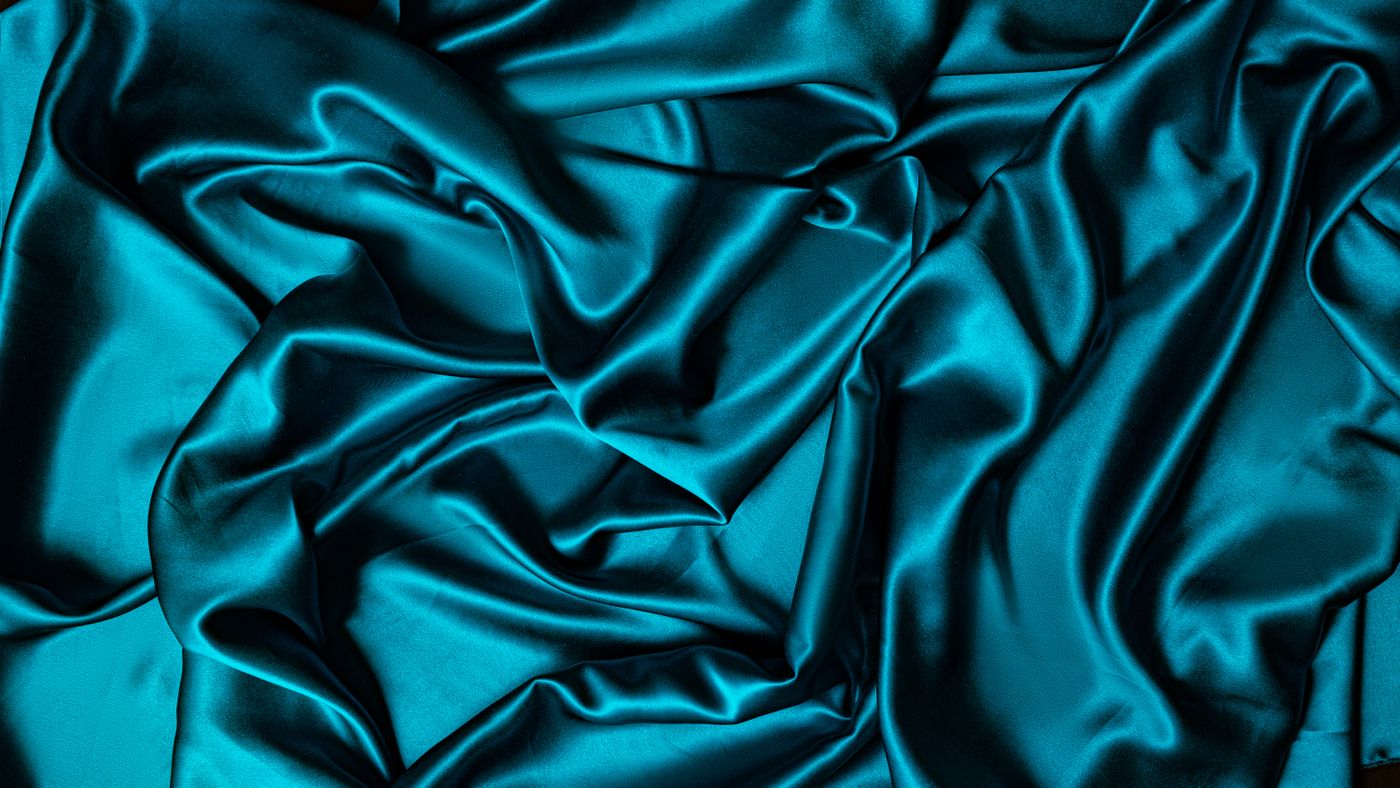
AT A GLANCE
Habotai can offer a light, softly moving alternative to a more substantial printed square, but the name alone does not describe every scarf. This guide examines translucency, layered color, folded volume, edge behavior, and practical wardrobe roles. It also explains how to ask for useful product information and assess a lightweight scarf without confusing delicacy with poor quality or assuming uniform performance.
Start with the effect of light cloth
A lightweight scarf can introduce color without creating a large visual or physical mass. It may settle into soft folds, reveal subtle changes as layers overlap, or let a garment remain visible beneath it. Habotai is a name encountered in this part of scarf shopping, but it should be treated as a starting description rather than a fixed promise. The useful question is what the actual cloth does when held open, gathered, and worn with the clothes you own.
Imagine the role before the purchase. You might want a small accent inside an open shirt, a loose ribbon of color, or a soft drape that moves easily rather than holding a sharply defined shape. Those goals differ from wanting a substantial square with a strong border and crisp folded volume. A lightweight cloth can be well suited to one role and less satisfying in another. Choosing it deliberately allows its character to be appreciated rather than judged against the behavior of a different textile.
Understand the name without making it a guarantee
The Museum of Fine Arts Boston's CAMEO materials reference describes habutai as a soft plain woven fabric associated with silk, and records several related spellings and names. Shoppers may encounter habotai, habutai, or China silk in product language. Terminology can vary, so read the actual fiber statement and any available fabric information. Do not assume that a familiar sounding name establishes a precise weight, origin, finish, or complete manufacturing history for the scarf being offered.
If the listing gives only the cloth name, ask for the dimensions, fiber content, and care guidance. Request a photograph that shows the surface and another that shows the scarf in a loose fold. The seller may not know every technical detail, and an honest limit is preferable to a confident invention. You can still decide whether the available evidence is enough for your intended use. The key is to preserve the distinction between a category description and the particular behavior you need to understand.
Evaluate translucency against real backgrounds
Lightweight cloth may reveal the color beneath it, depending on density, color, and finish. Test or request views against both pale and dark backgrounds. A soft cream scarf can appear quite different over a white shirt and a charcoal knit. This is not necessarily a defect or a sign of inadequate material. It is part of the visual relationship between the textile and the garment. Decide whether you enjoy the interaction before choosing a scarf primarily from an image on a neutral studio background.
Look at single and overlapping layers separately. The area where two folds cross can appear deeper or more saturated than the open cloth beside it. A softly arranged scarf may therefore create its own tonal pattern even when the fabric is one color. If you want a uniform opaque field, that behavior may not suit the role. If you enjoy subtle variation, it can be appealing. The comparison should be about the desired effect, not an assumption that greater opacity always means better quality.
Notice how color changes through layering
A lightweight scarf's palette can develop through the arrangement itself. A pale printed area may become stronger when folded over another section; a border may appear and disappear as the cloth turns. This makes the scarf less like a fixed image and more like a sequence of partial views. When evaluating a design, ask to see it gathered as well as open. A flat product photograph may understate the depth created by overlapping layers or conceal a contrast that becomes prominent in a folded band.
Try the scarf with a garment whose color you know well. Observe whether the combined effect remains pleasing as the cloth moves. A background that subtly shows through can connect the scarf to the outfit, while another background may muddy a color you expected to remain clear. Neither response can be judged confidently from the name habotai alone. The useful evidence is the actual textile in context. If exact color control is important, preserve an exchange option rather than relying on a screen comparison.
Let soft drape be a positive choice
Some scarf arrangements depend on a cloth that holds a defined fold. Others benefit from a softer, less architectural movement. A lightweight habotai scarf may appeal because it does not insist on a rigid shape. Let the corners fall and see whether the result feels natural with the garment. If you repeatedly press and tighten the fabric to imitate a substantial twill square, you may be asking it to perform a role that does not match the reason for choosing it.
Consider a loose band, a gentle drape, or another simple arrangement that allows movement. The cloth can provide a quiet transition between a collar and the rest of the outfit without becoming a large knot. This is particularly useful when you prefer a small amount of fabric near the neckline. Do not assume that a soft drape must look careless. Proportion, visible color, and clear spacing around other accessories can make a relaxed arrangement feel considered without forcing every fold into symmetry.
Distinguish small volume from short length
A lightweight scarf may occupy little space when folded, but its dimensions still determine the arrangements it can support. A small square can feel compact and still leave insufficient length for a comfortable fastening. A large lightweight square may create more layered cloth than expected when repeatedly folded into a narrow band. Read both dimensions and imagine the fold before concluding that the scarf will be unobtrusive simply because its fabric appears light.
Use a familiar scarf as a size reference if possible. Compare where the corners fall and how much material remains after the intended fold. If you want an especially slim accent, consider whether a narrow rectangle would achieve it more easily than a large square. Shape can solve a volume problem that fabric choice alone cannot. Comfort should remain the deciding factor. Do not pull a short scarf tightly or compress a large one aggressively in pursuit of a small visual footprint.
Inspect the edge at its real scale
An edge on lightweight cloth can influence the way the scarf hangs. Look for secure finishing without judging every tiny variation as a major flaw. A close photograph can make a narrow hem appear substantial, while a distant image can hide an opening or loose stitch. Ask for a view that shows both detail and context. The perimeter should make sense with the cloth's softness and the intended design, rather than conform to a single rule about what every luxury scarf edge must look like.
When the scarf arrives, let it rest on a clean surface and inspect the corners gently. Do not pull the edge to test strength. If a section appears distorted, photograph it and ask the seller whether it reflects the intended construction or a condition issue. A light fabric does not excuse an opening hem, but delicacy should not automatically be interpreted as poor workmanship. The assessment should focus on security, coherence, and suitability for ordinary gentle handling.
Compare with twill through the same task
If deciding between a lightweight plain woven scarf and silk twill, choose one task and compare both against it. For a compact collar accent, examine folded thickness and ease of fastening. For a visible panel, look at opacity and the clarity of the print. For a loose drape, observe movement and how the ends settle. This avoids a vague competition in which one textile is declared more luxurious without reference to the role it is meant to perform.
You may find that each serves a different outfit. A more substantial twill can provide a defined border beside a jacket, while a lighter scarf may add color without crowding an open neckline. Those are complementary possibilities rather than opposing grades. Keep the observations specific so they help with future choices. Knowing that you prefer less folded volume in one garment is more useful than deciding that you always prefer one fabric name, regardless of dimensions, finish, or design.
Compare with satin through reflected light
If another candidate has a satin surface, notice how reflection affects the outfit. A luminous highlight can make a scarf visually prominent even when its dimensions are modest. A softer looking surface may recede more easily beside detailed jewelry or a textured garment. The actual result depends on the particular fabrics, so avoid assuming that every satin scarf shines equally or every habotai scarf appears matte. Ask for ordinary lighting views and observe movement rather than rely on a single bright image.
The decision can be about attention. Do you want the scarf to become the first visible accent, or to connect other elements quietly? A lightweight cloth that changes subtly through layering can provide interest without a strong reflective statement. Another scarf may be chosen precisely for its bright surface. Neither effect is inherently more refined. The useful comparison is whether the material's appearance supports the outfit and feels comfortable to the person wearing it, not whether it conforms to a general hierarchy of shine.
Keep contact with jewelry deliberate
A softly moving scarf can travel into areas that seemed clear when it was first arranged. Check chains, clasps, earring backs, pendant settings, and textured metal before wearing them nearby. A simple smooth necklace may still have a rough attachment point. Place the accessories so the scarf's loose edges do not repeatedly cross unresolved catching surfaces. This is a matter of spacing and condition rather than a prohibition on combining lightweight silk with jewelry.
Test removal as well as wear. A corner that passes easily beside earrings while standing may catch when the scarf is lifted over the head. Slow down and look at the route. If fabric catches, stop the tension and identify the obstruction before pulling. Do not trim a projecting thread without suitable advice. A lightweight textile deserves the same measured handling as a more substantial one, and a simple arrangement can reduce the number of complicated contact points encountered during dressing and undressing.
Use photography to ask better questions
For online shopping, request one image with the scarf open, one over a dark background, one over a pale background, and one in a loose fold if those views are missing. These are practical requests connected to translucency and drape. They are more informative than asking whether the cloth feels expensive. A short video can also reveal how the textile responds when lifted and released. None of these observations proves composition, but they can clarify the behavior relevant to your decision.
Keep lighting and image processing in mind. A strongly backlit photograph may exaggerate transparency, while a folded studio image may make a light cloth appear more opaque. Read the views together and ask about the actual material statement. If the listing uses several names inconsistently, seek clarification before purchasing. You do not need to resolve every textile term yourself. A clear seller response and reasonable return terms can provide a sounder basis for choice than a confident interpretation built from incomplete photographs.
Plan care for the actual scarf
Preserve the maker's instructions and follow them for the finished textile. A cloth name does not establish how a particular dye, print, or finish should be treated. Avoid assuming that lightness means easy washing or that every silk accessory can be cared for with the same household method. If instructions are absent or contradictory, ask before applying moisture, heat, or a spot treatment. The finished scarf's needs are more specific than the general category it belongs to.
After wear, undo the arrangement gently and inspect the cloth before suitable storage. Keep it separate from rough objects and jewelry. If a mark appears, record its cause if known and seek appropriate advice rather than experimenting with several products. A lightweight scarf can be practical when its role and maintenance needs fit your habits. It becomes frustrating when purchased as an abstract promise of effortless delicacy without considering how it will be handled, worn, and put away in ordinary life.
Choose lightness with a clear purpose
The strongest reason to choose a habotai scarf is that its particular behavior supports something you enjoy wearing. It may create a soft color accent, reveal pleasing layers, or fit comfortably where a more substantial square feels crowded. Those are specific benefits you can observe. They do not require the cloth to be ranked above or below other silk structures. The scarf's value in your wardrobe comes from the relationship between its material, dimensions, design, and intended use.
Take time to look at translucency, compare folds, and test the textile against familiar clothes. Read material claims separately from styling language, and keep uncertainty visible when information is missing. Once the choice is made, allow the scarf to remain soft and mobile if that is its character. A considered accessory does not need a rigid outline. Sometimes its most useful contribution is a small amount of color that moves easily, connects the outfit, and remains comfortable enough to be worn again.
References & further reading
References provide background and further reading. Linked organizations do not endorse or certify this publication.
For general education. The identity, treatments, construction, and condition of an individual object may require professional examination. Our editorial approach.
Back to the beginning