AT A GLANCE
A surface finish can make the same silver form feel crisp, quiet, tactile, or expressive. Compare polished, brushed, hammered, and mixed finishes through ordinary light, clothing, and wear rather than a single studio photograph. This guide explains what to ask about consistency, maintenance, refinishing, and visual balance before choosing a surface you will live with every day.
Finish is part of the design, not a final decoration
Two pendants with the same outline can create very different impressions when their surfaces are finished differently. A polished disk can act like a small moving mirror. A brushed disk can read as a broad, quieter field. A textured disk can break light into many separate points. The finish determines how the object meets its surroundings, so it deserves attention early in the buying decision. It is not simply a choice to be added after every other aspect of the jewelry has been settled.
Begin by deciding how much visual presence you want. A reflective surface can be assertive even when the pendant is small. A subdued finish can make a larger form easier to integrate into a simple outfit. These are tendencies to observe, not rules that assign one finish to one personality or occasion. The most useful comparison is made with the actual shape, dimensions, and clothing you expect to wear, because surface and form work together rather than producing separate effects.
A high polish reflects more than light
Highly polished silver reflects shapes and colors from its environment. A pendant may appear pale in a product photograph because it is surrounded by a broad light surface, then look darker at home when it reflects clothing or furniture. This does not necessarily indicate a change in the metal. It is part of the visual behavior of a reflective finish. Ask for more than one view when shopping remotely so that one carefully arranged highlight does not become your entire expectation of the object.
A polished finish can emphasize a clean outline and make simple geometry feel precise. It can also make small surface marks easier to notice because they interrupt a relatively continuous reflection. Consider whether you enjoy that evolving appearance or expect frequent maintenance to retain a highly uniform surface. There is no need to reject polish because it can show wear. It is more useful to understand the kind of visual change you are likely to notice and whether that suits your preferences.
Brushed and satin descriptions need clarification
Words such as brushed, satin, matte, and frosted are not always used consistently between sellers. One workshop’s satin surface may be another shop’s fine brushed finish. A directional texture can reflect differently from a more evenly diffused one. Ask for a close image and an ordinary-distance view, and request the maker’s explanation of how the surface should be maintained. The label alone may not tell you whether the finish has a visible grain or how easily it can be renewed.
Look at the direction of the surface relative to the shape. A vertical grain on an elongated pendant can reinforce its length, while a circular pattern can echo a disk’s outline. A finish that appears uniform from the front may show directional changes at an angle. These details can contribute to the design’s character without being immediately obvious in a catalog image. If consistency matters to you, ask what degree of variation is expected between individually finished pieces.
Texture can create rhythm without a motif
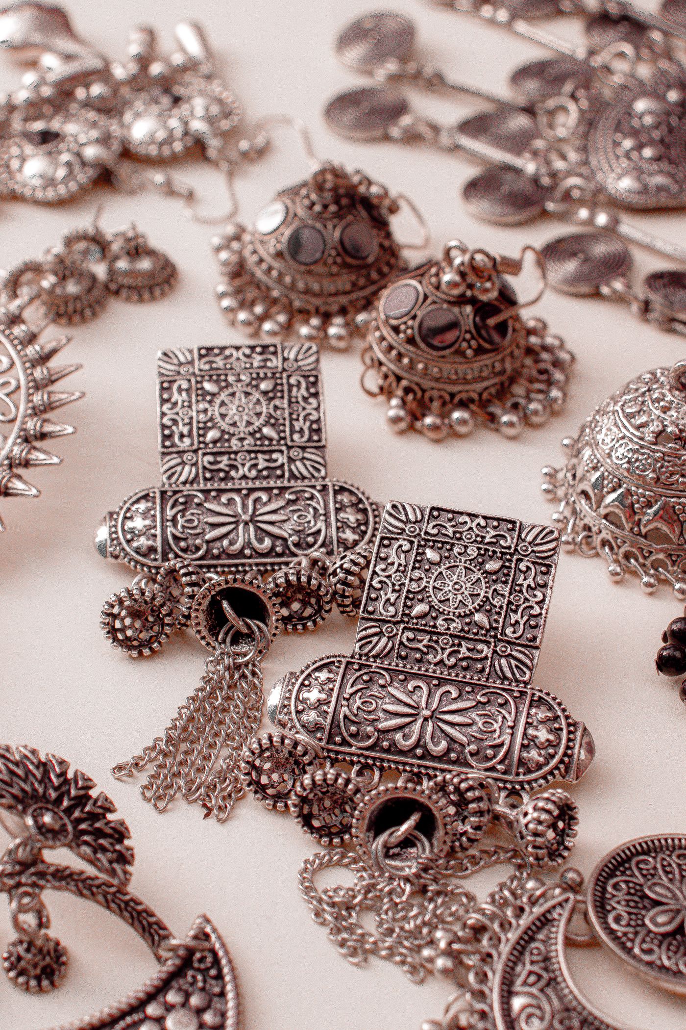
Hammered, stippled, carved, and otherwise textured surfaces can make an undecorated form feel lively. Their repeated changes in plane catch light differently as the wearer moves. A broad hammered cuff may show larger reflections than a finely textured pendant, even if both are described with the same word. Scale matters. Ask whether the photographs show the actual item or a representative example, particularly when the pattern is created individually and each piece can vary.
Texture is not automatically more forgiving or more durable. Raised points can contact surrounding objects, and recesses may require particular care. A rough-looking surface should still be appropriate where it touches skin or fabric. Run the piece through an ordinary fitting rather than judging tactile comfort from appearance. A surface can be visually complex and physically smooth, or visually simple and unexpectedly sharp at an edge. Those are separate aspects of the object that deserve separate observation.
Mixed finishes create a visual hierarchy
A polished border around a matte center can make a pendant’s outline clearer. Bright raised details against a darker or textured background can help a motif read at normal distance. These contrasts can be effective, but they also need coherent proportions. If every area competes through a different finish, a small object may feel busy. Decide which part should lead and whether the other surfaces support that intention. A close-up can make tiny contrasts seem more important than they are when worn.
Ask how the different areas will be preserved during maintenance. A general polishing treatment may blur the boundary between finishes or change a surface that was intended to remain quiet. The maker may recommend a specific approach or offer refinishing as a service. Understanding this before purchase helps you decide whether the design suits your routine. A beautiful contrast is easier to enjoy when you know which changes are expected and which require professional attention.
Shape and finish should be assessed together
A domed surface gathers reflections differently from a flat one. A narrow ridge can create a strong highlight even when the surrounding area is matte. A textured edge may appear more prominent than a broad smooth center. These relationships explain why a finish you like on one object may not appeal on another. Compare complete forms rather than selecting a surface treatment in isolation and assuming that it will produce the same effect across every pendant, ring, or cuff.
Depth can also influence how the finish is seen. A sculptural pendant may reveal changing planes as it turns, while a flat design may depend more on its front surface. Ask for side and reverse views. If the pendant flips during wear, the back will become part of the composition. A thoughtfully finished reverse can make that movement feel intentional. A design should not rely on an invisible display stand to keep its most attractive surface permanently facing outward.
Clothing is the background you actually wear
Try the finish against plain and textured garments. A polished surface may stand out strongly against matte dark fabric, while a brushed surface may create a subtler transition. A highly textured pendant can echo knitwear or compete with a busy print. Neither response is inherently wrong. Decide whether you want a focal point, an integrated texture, or a quiet accent. That intention is more useful than a general claim that one finish is always appropriate for work and another only for evening.
Pay attention to edges and projecting details when using delicate textiles. A textured appearance should not be allowed to excuse snagging. Ask whether the design is intended to sit over clothing or against skin and inspect the relevant contact surfaces. A finish may be pleasing visually while the object’s placement creates an avoidable practical problem. A small change in chain length or wearing position can sometimes resolve the issue without requiring a different surface or a different pendant.
Light conditions can reverse a first impression
Jewelry viewed under concentrated shop lighting may appear more brilliant or more textured than it does in a softly lit room. Outdoor diffuse light can reveal a different set of details. If possible, compare the piece under several ordinary conditions without expecting it to maintain one photographed appearance. A finish that feels too assertive under a spotlight may be quiet in daily use. Conversely, a subtle texture may become difficult to see when the light is flat.
When shopping remotely, ask for a short movement view or a photograph taken without dramatic staging. Be cautious about images with heavy sharpening or contrast, which can exaggerate surface relief. This does not require assuming that every seller is misleading. Photography is always selective. Your task is to gather enough views to understand the object beyond that selection, especially when the finish is the main feature that distinguishes it from a simpler piece of similar shape.
Contact marks are not identical across finishes
Everyday contact can change the way a surface reflects. A bright finish may show an individual scratch clearly, while a directional finish may be interrupted by a mark running across its grain. A textured surface may visually integrate some small changes while developing wear on raised areas. These are reasons to discuss expected aging with the maker. They are not grounds for a universal promise that one finish hides all damage or that another must be kept untouched to remain attractive.
Think about the object’s location on the body. A ring contacts more surfaces than a pendant worn quietly against a shirt. A cuff may meet a desk repeatedly. A pair of earrings may experience a different pattern of handling. The finish should be chosen with that context in mind. You can enjoy a surface that acquires visible marks, but it is better to make that choice knowingly than to discover that your expectation of permanent uniformity was unrealistic for the intended use.
Do not assume a matte finish requires no care
A less reflective appearance can conceal some changes while still needing suitable handling. Residues, coatings, and neighboring materials remain relevant. A polishing cloth intended to brighten silver may alter a brushed area, and household abrasives may create a new texture rather than restore the original one. Ask what routine is approved for the complete object. If the finish is unfamiliar, avoid experimenting on a hidden area under the assumption that any damage there will be unimportant.
The same caution applies to high polish. A quick household shortcut may produce shine while changing edges or leaving residues in recesses. Before using a product, identify the materials and read the maker’s instructions. Jewelry containing stones, wood, lacquer, cord, or adhesive should not automatically receive a routine intended for plain exposed silver. Finish choice and material choice are connected ownership decisions, not separate shopping categories that can be maintained without reference to each other.
Refinishing is a service to understand before you need it
Ask whether the maker can renew the finish and what that process would involve. Some textures can be recreated more readily than others, and repeated treatment may affect fine details or dimensions. An all-over refinish can also change deliberate contrasts. A promise that a piece can always be made new again deserves clarification. Ask which areas may change and whether there are limits created by plating, engraving, thin sections, or mixed-material construction.
If refinishing is important to you, keep the original product description and clear photographs. These provide a useful reference when a later repairer has not seen the piece in its initial state. Describe the appearance you want preserved rather than asking only for polishing. The word polish can be interpreted broadly in a service setting. A written instruction that the directional center should remain matte while only the rim is assessed is more actionable than an assumption that the professional will infer your preference.
Consider variation in handmade surfaces
Individually applied textures can vary in density, direction, and depth. A maker should be able to explain which variations belong to the design and which would be considered defects or departures from the order. Variation is not a universal excuse for poor comfort, inconsistent dimensions, or a different motif. Ask for the actual piece’s photograph when the precise arrangement matters. If ordering a pair or a set, discuss whether the surfaces are intended to match closely or relate more loosely.
For a commission, agree on a sample, drawing, or reference that communicates the intended finish. A photo alone may not capture tactile qualities, so include a plain-language description. Specify whether you prefer high reflection, a visible directional grain, or a subdued texture. Clear communication gives the maker a workable target without demanding an impossible pixel-for-pixel reproduction of light on metal. It also helps prevent a later disagreement that is really about vocabulary rather than workmanship.
Pairing finishes can be more flexible than matching them
You do not need every silver object in an outfit to have the same surface. A polished chain can provide a quiet line beside a textured pendant, or a matte cuff can balance bright earrings. The relationship works when the pieces share enough in scale, shape, or overall intention to feel coherent. An exact finish match may be unnecessary and difficult to maintain as objects are worn differently. Deliberate variation can be easier to live with than an expectation of permanent uniformity.
Try combinations at normal viewing distance. A pair that appears mismatched in macro photographs may look harmonious across an outfit, while two technically similar finishes can compete when both are visually assertive. If the pieces physically contact one another, assess that interaction separately from the visual result. A successful styling choice should not require accepting repeated abrasion or impact. You can coordinate materials across different parts of the outfit without stacking every silver object in the same place.
Choose the surface you want to see in ordinary life
Before deciding, describe the finish in your own words and check that the seller’s explanation matches your understanding. Consider the clothing, light, contact, and maintenance that will shape its daily appearance. If a feature is central to your choice, such as a quiet brushed field or a bright engraved edge, ask how it will evolve and what support is available. These questions make the decision more concrete than choosing between labels that different makers may use differently.
An effective finish gives a form the right visual voice for the wearer. It can be precise, soft, lively, or restrained without belonging to a fixed hierarchy of quality. The best choice is one whose appearance you understand and whose care requirements you can reasonably follow. When shape, surface, and use align, the jewelry does not need to look permanently identical to its product photograph. It can remain coherent as a real object that moves through light and acquires an ordinary history of wear.
For general education. The identity, treatments, construction, and condition of an individual object may require professional examination. Our editorial approach.
Back to the beginning